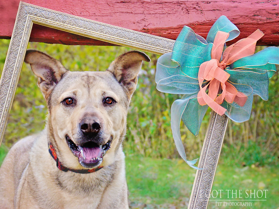
I remember it being very green and sunny. It would have been better if the reddish fence were not there, and/or the bow was missing. But, you learn by doing, and you make mental notes in that vast notebook in your brain that say things like: "Next time, skip the bow."
This week our task was to look back at some of our work and determine how we use color. The photo above is the only image from the "way back" that I will use. The images below are much more recent.

On the one side of the wheel you see warm colors (yellow, orange, red). On the other side are cool colors ( purple, blue, green). If I pick a bright red, then look directly across from it, I will see a bright green. These two colors would be complementary. So if I am shooting in green grass, using red to complement that in some way would work.
Not so very long ago, when we were talking about the Zone System, I took our dog Moe to the park to model for me. Moe is often selected because he is calm, quiet, and stays where and when you tell him to stay. The photo below is one where I sought to use a color scheme that would allow me to showcase Moe.
It was a wintery day. The grass is not a lush green. The colors of the playground equipment are vivid and bright. Moe was actually pretty reluctant to leave this newfound hidey hole. Doesn't he look comfortable?
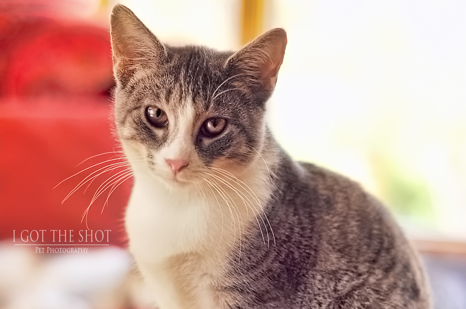
And finally, for this week, a photo of our cat Matty, surrounded by mish-mosh. Mish-mosh is what I affectionately call the "stuff" that appears in the backgrounds of my photos that is unrecognizable, but sometimes colorful. The amount of mish-mosh is directly proportionate to how much time I've had during a given week to do mish-mosh intervention work.
To see more colorful contrast work, you know what to do...start here with Becky Willuweit of Future Framed Photography in South Dakota, then work your way around the blog circle until you are right back where you started. Happy Friday!


 RSS Feed