Last week I mentioned that I do 80% of my photograph work with my image quality setting at RAW or NEF (Nikon). Twenty percent of my work is done using JPEG. I have very real reasons for the times I use JPEG, and most of them have to do with the size of the file, how many shots I will be taking and how much time I need to put into editing, but RAW is my choice for studio and client work.
I must admit that I do use histograms. Early on in the 2012 timeframe, I took a very good class locally that covered reading histograms and using them correctly. If you are wondering what a histogram is, it looks like this:
I must admit that I do use histograms. Early on in the 2012 timeframe, I took a very good class locally that covered reading histograms and using them correctly. If you are wondering what a histogram is, it looks like this:
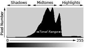
My instructor at the time told us our best bet was to "shoot for the midtones" and to try to have your histogram somewhat evenly spaced and spread out across the image (depending upon the image and lighting, of course). He also warned us against large peaks or lines to the far right and far left of the histogram, which could signify too dark or too light (with no details in either) areas in the photo.
In the book, The Visual Toolbox, our author says much the same things, but has thrown in the fact that there is often more detail (and data) to the right of the image than to the left. That makes sense to me, because the right holds data from the light, which (except for blown out highlights) can be much more malleable than data to the left.
Now just to play devil's advocate, here is an article by Ken Rockwell concerning histograms. Ken is pulling no punches about what histograms mean to him.
So where do I fall? I fall somewhere in the middle of these two discussions. I believe that placing all your weight on a histogram may not cut it for the photo you are seeing, and the same goes for placing all your weight on just the image in the back of the camera. I think you have to use both, plus experience gained from practice.
Let's use this example. I have used Billie this week as my model because she is the HARDEST dog to photograph. Not only does she constantly move around all the time, but she has this super-large range of white-to-black colors in her fur. The top of her head can often get blown out due to the highlights there. It's only through experience that I know what the RAW image and histogram need to look like for Billie, and, again, it depends on the lighting that surrounds her. In the image below, I had a little bit of a "highlight warning" on the top of her head, but I know that if I try to expose for the top of her head in this light, her dark eye circles would be even darker and you might not see the detail there. Remember, that lighter data, for Billie, is more usable for me than the darker data, so I am not going to pay attention to the highlight warning here. I let Moe photo bomb her because I knew the additional white to the right would also highlight Billie's coloring, and Moe, even as a blob, is cute.
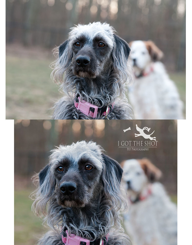
What I did to this photo in post processing: brightened, increased saturation, brightened Billie's eyes, straightened it, and used a color brush on the filtered sunlight in the trees and the grass to the left. I then cropped it, and sharpened to 20%. And that is my goal.....minimal post processing by getting the histogram and LCD image to cooperate fully.
Now, here is another image. In this image, my histogram leaned more toward the middle range (midtones). This was taken in a different light situation (mid-day as opposed to end of day). There were absolutely no in-camera warnings while making this photo. You can see how a midtone-range image fares once edited.
Now, here is another image. In this image, my histogram leaned more toward the middle range (midtones). This was taken in a different light situation (mid-day as opposed to end of day). There were absolutely no in-camera warnings while making this photo. You can see how a midtone-range image fares once edited.
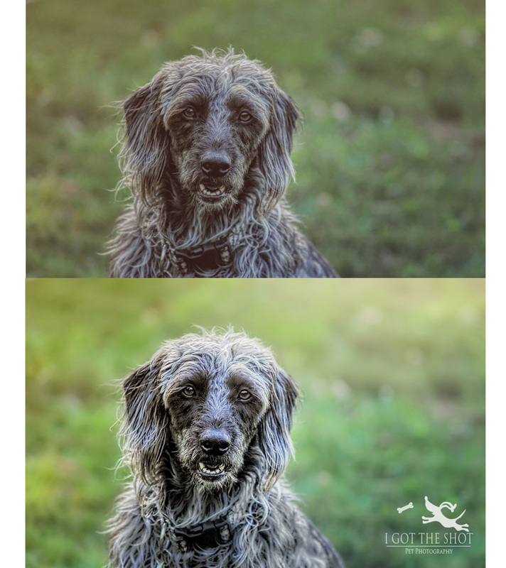
I applied much the same type of edit to this photo. Adjustments to brightness, saturation, contrast, sharpness and a whisk of the color brush. RAW images allow for more data manipulation than JPEG, and with the right combination of histogram and LCD, even Billie becomes an easy target.
For more on this week's theme, start with Pet Love Photography, serving Greater Cincinnati and the San Francisco Bay Area, then continue to follow the blog ring until you are right back where you started. Enjoy!
For more on this week's theme, start with Pet Love Photography, serving Greater Cincinnati and the San Francisco Bay Area, then continue to follow the blog ring until you are right back where you started. Enjoy!
 RSS Feed